EDEN’S
FROLIC
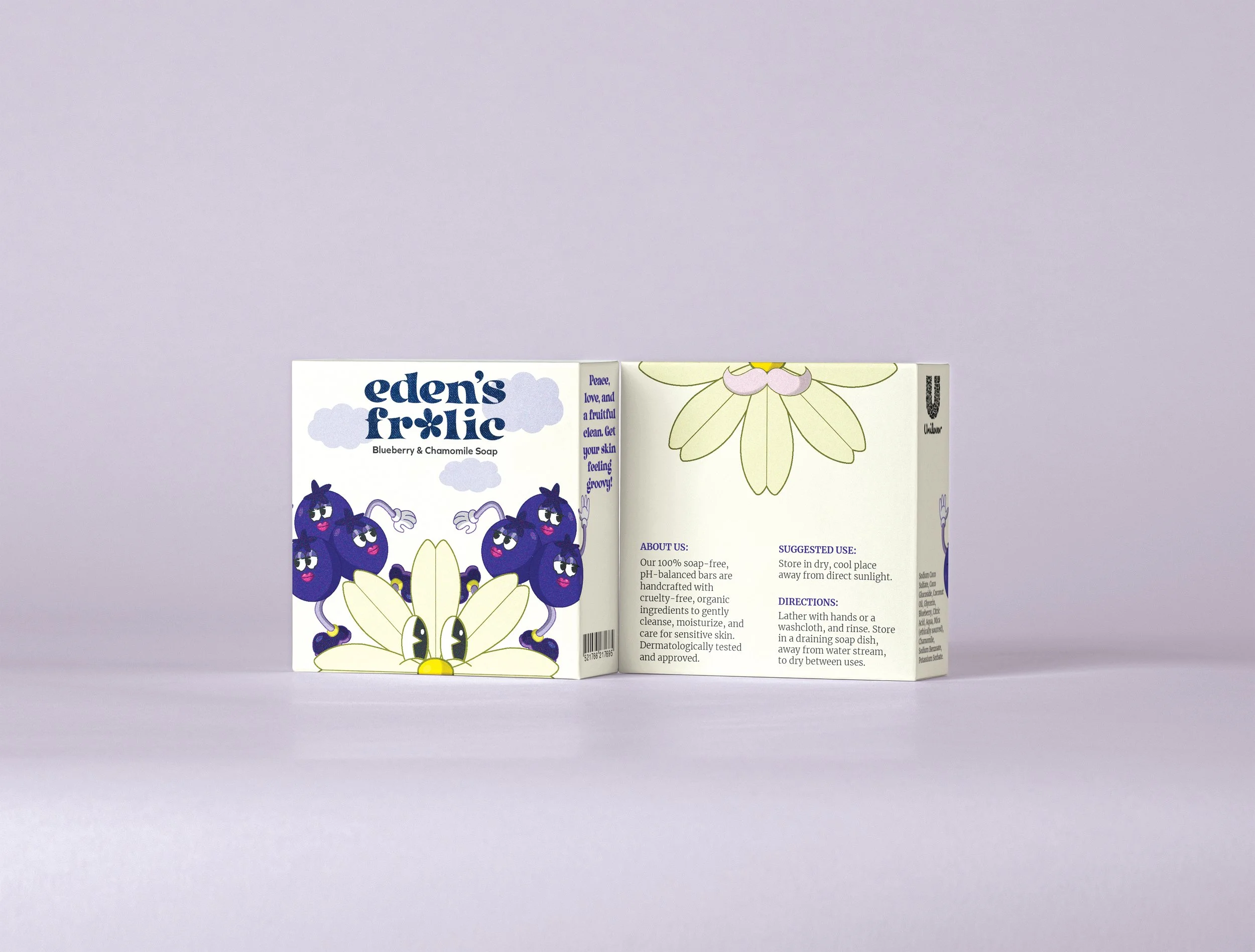
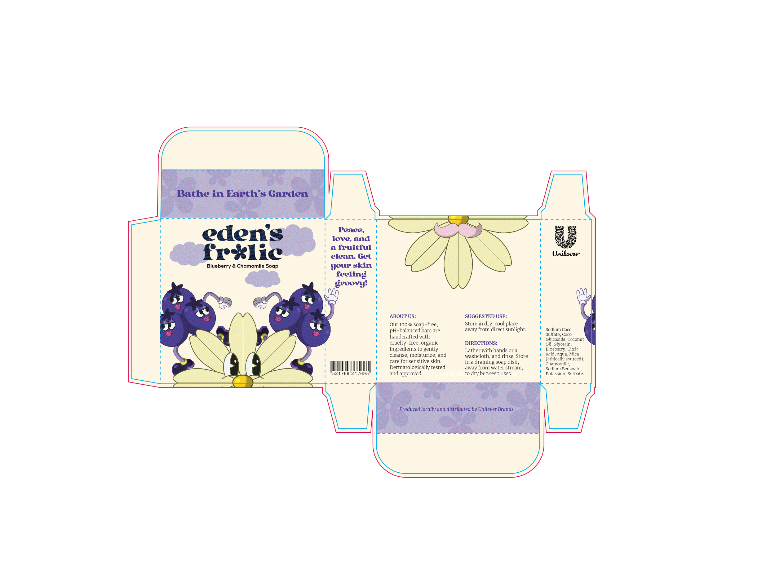
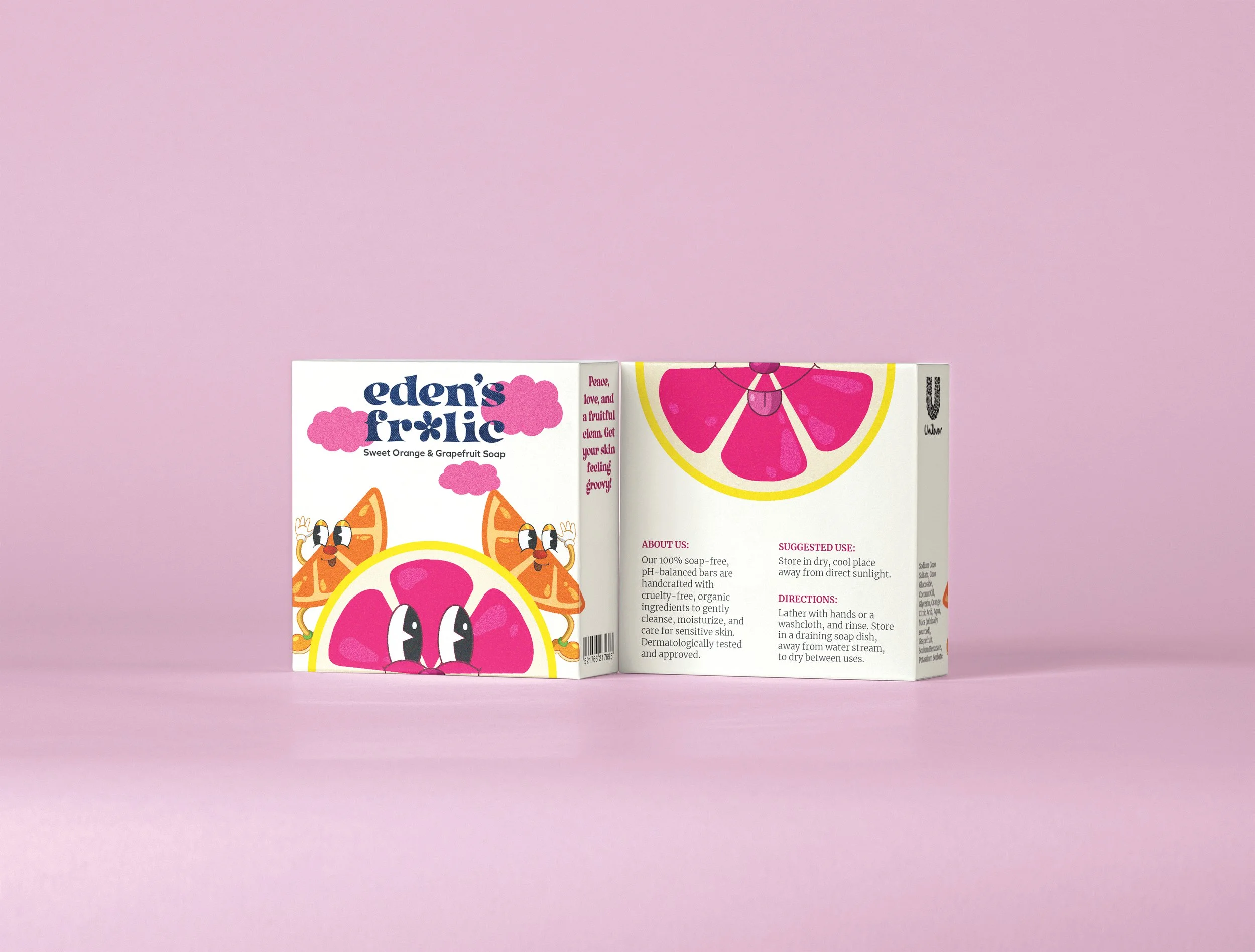
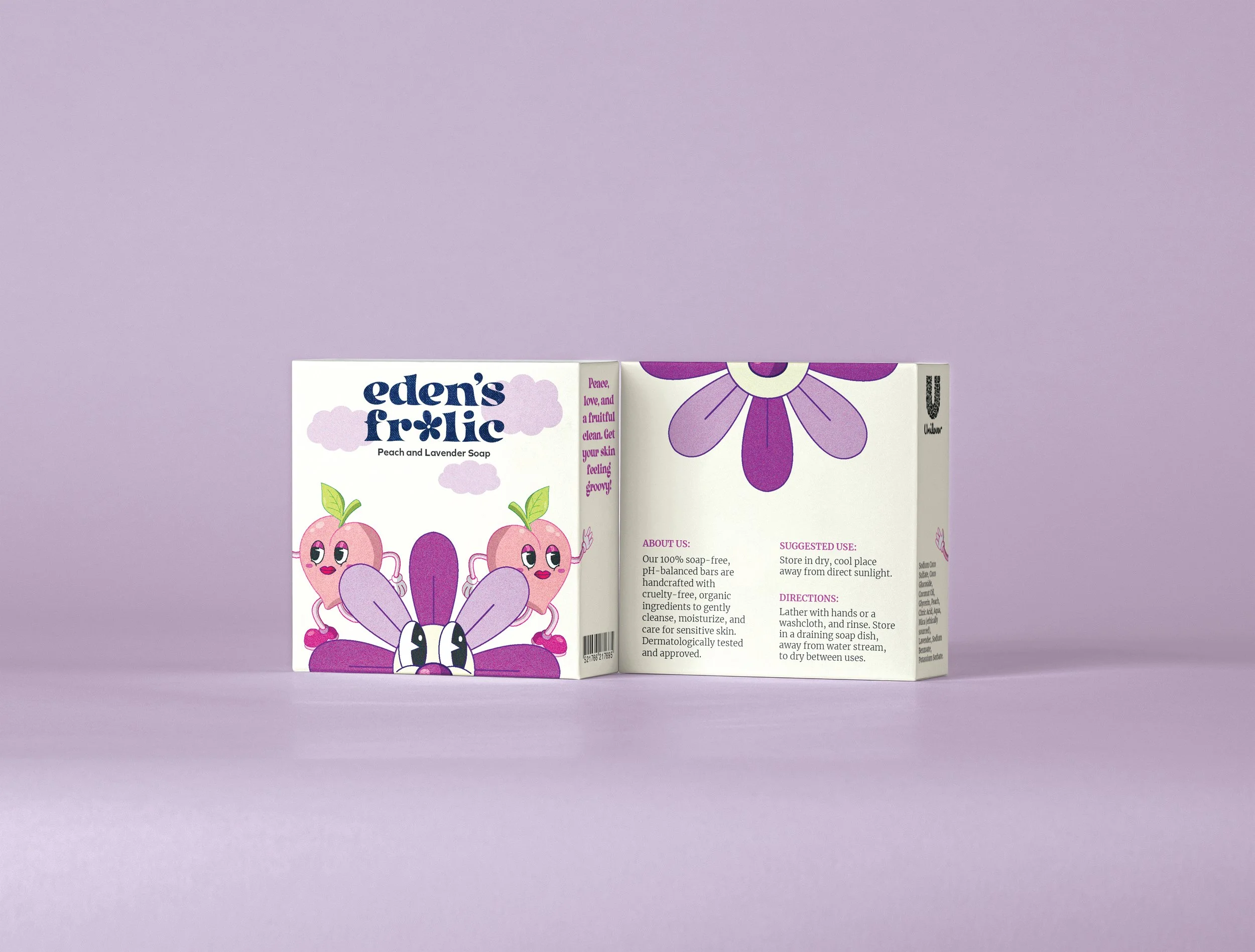
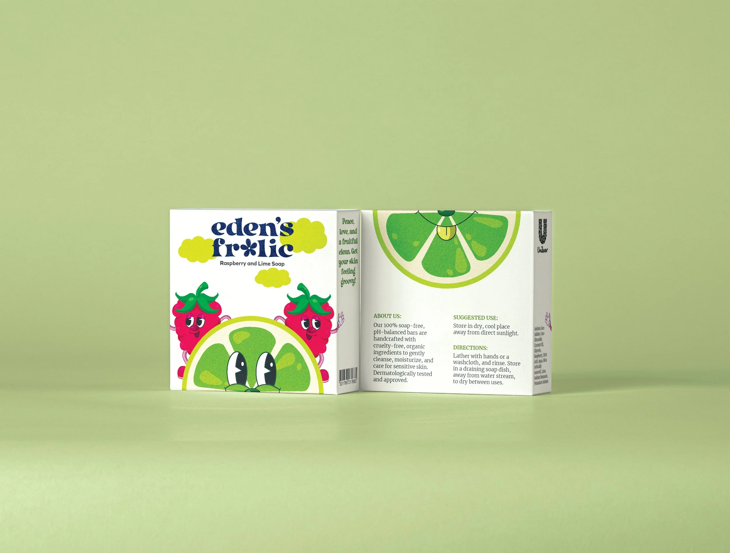
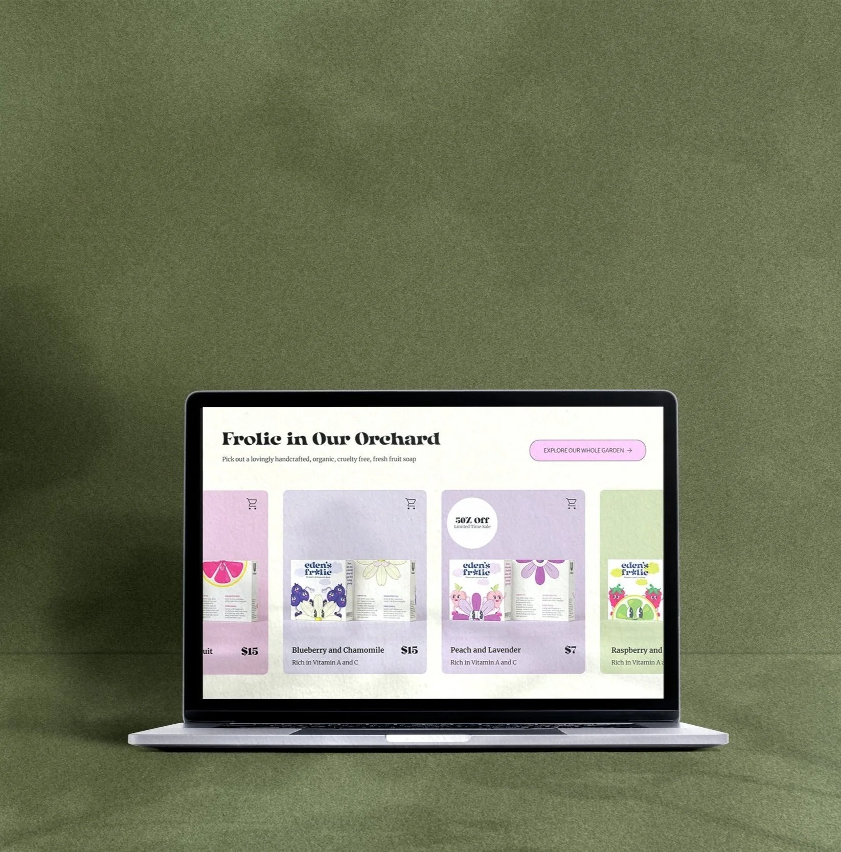
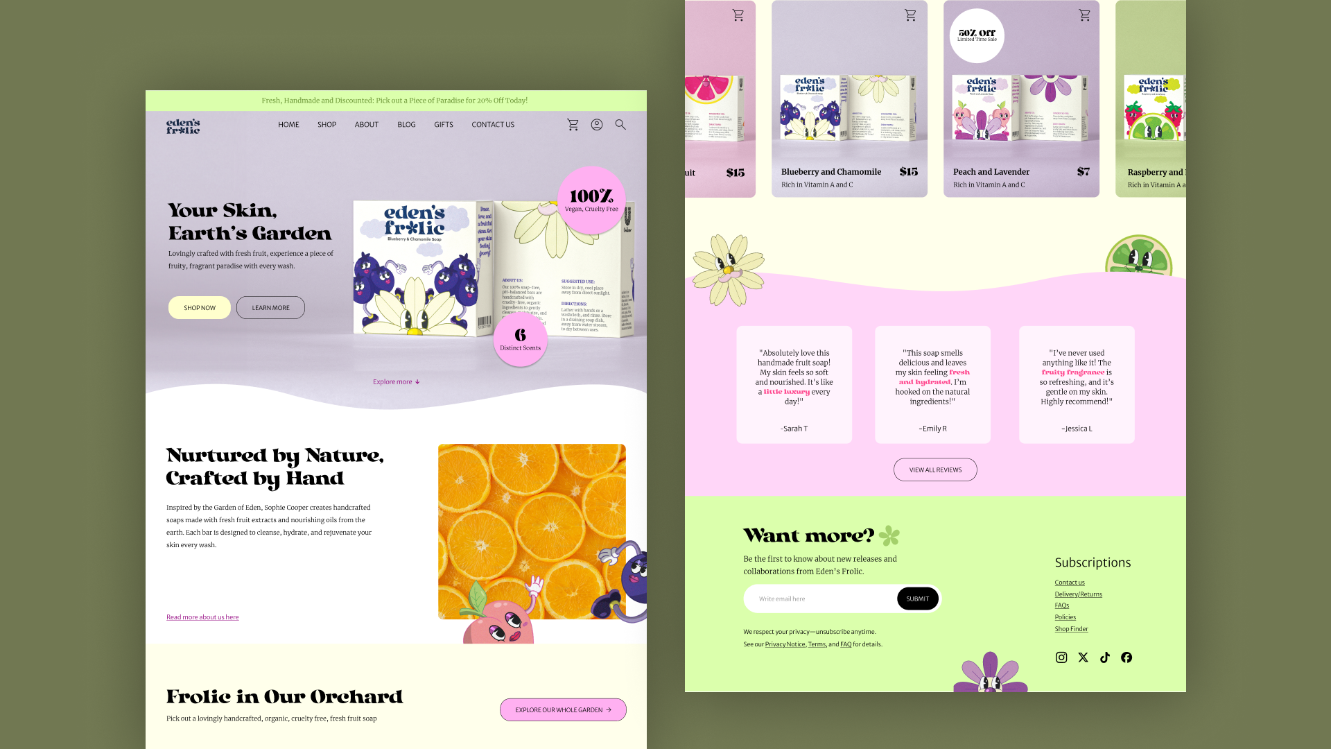
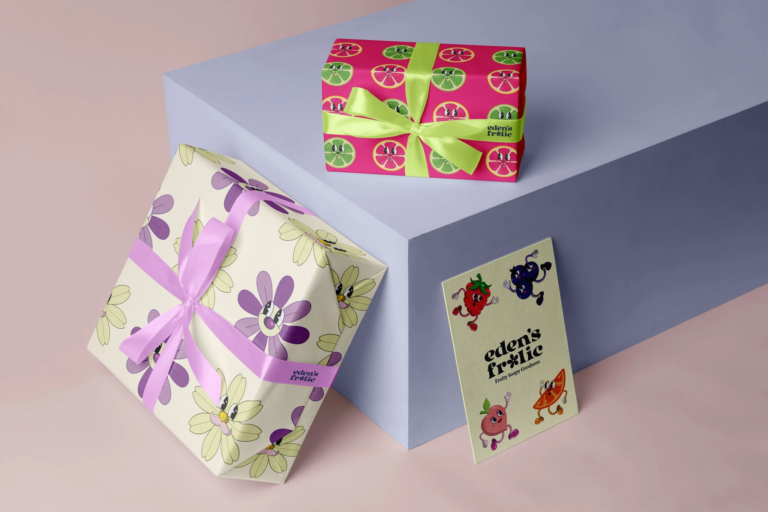
A branding project for handmade fruit soap brand founded by Sophie Cooper, featuring locally sourced, all-natural ingredients. Eden's Frolic's brand identity and packaging design derives influence from the Garden of Eden—celebrating nature’s purity and abundance. The visual concept draws heavily from 1970s retro aesthetics, paying homage to the free-spirited ethos of the hippie movement while reflecting the brand’s connection to nature and authenticity. The 70's aesthetic is present everywhere from the whimsical typeface to the handmade, digitally illustrated characters.Packaging and Dyeline
Process
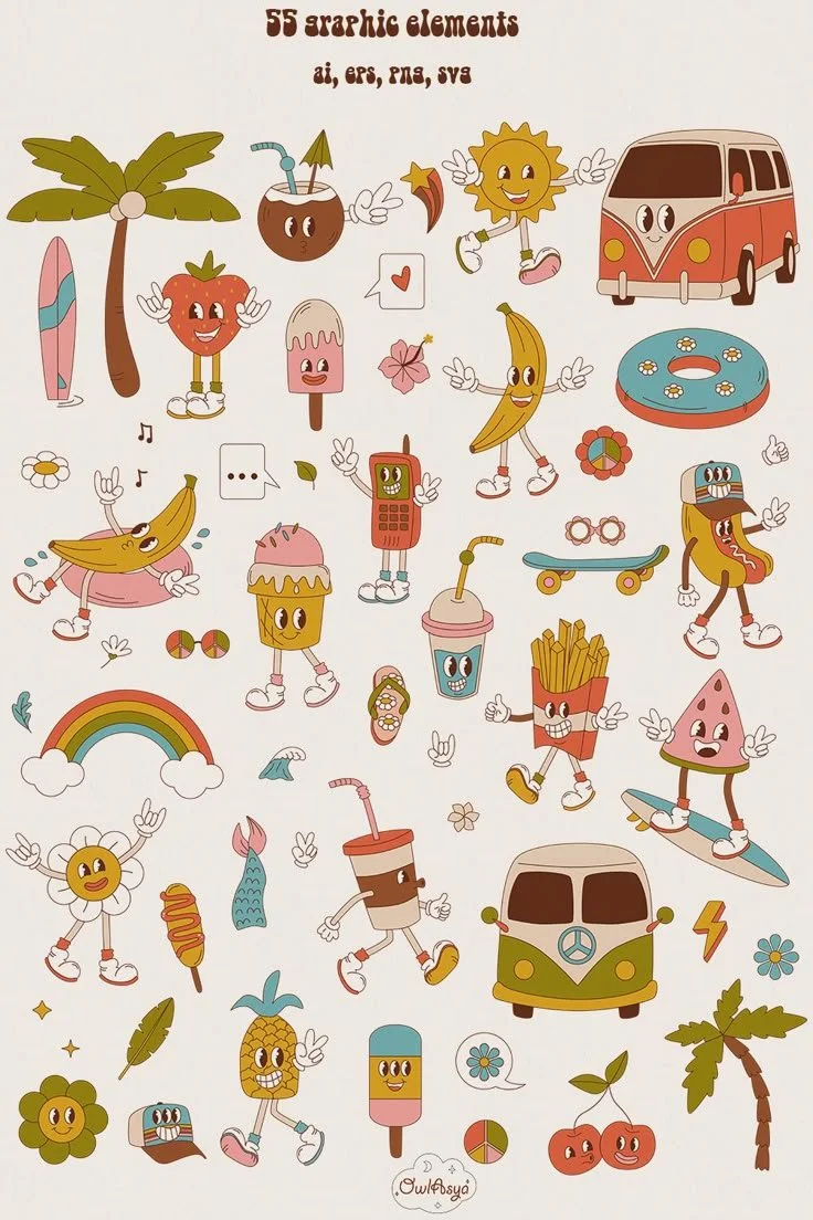
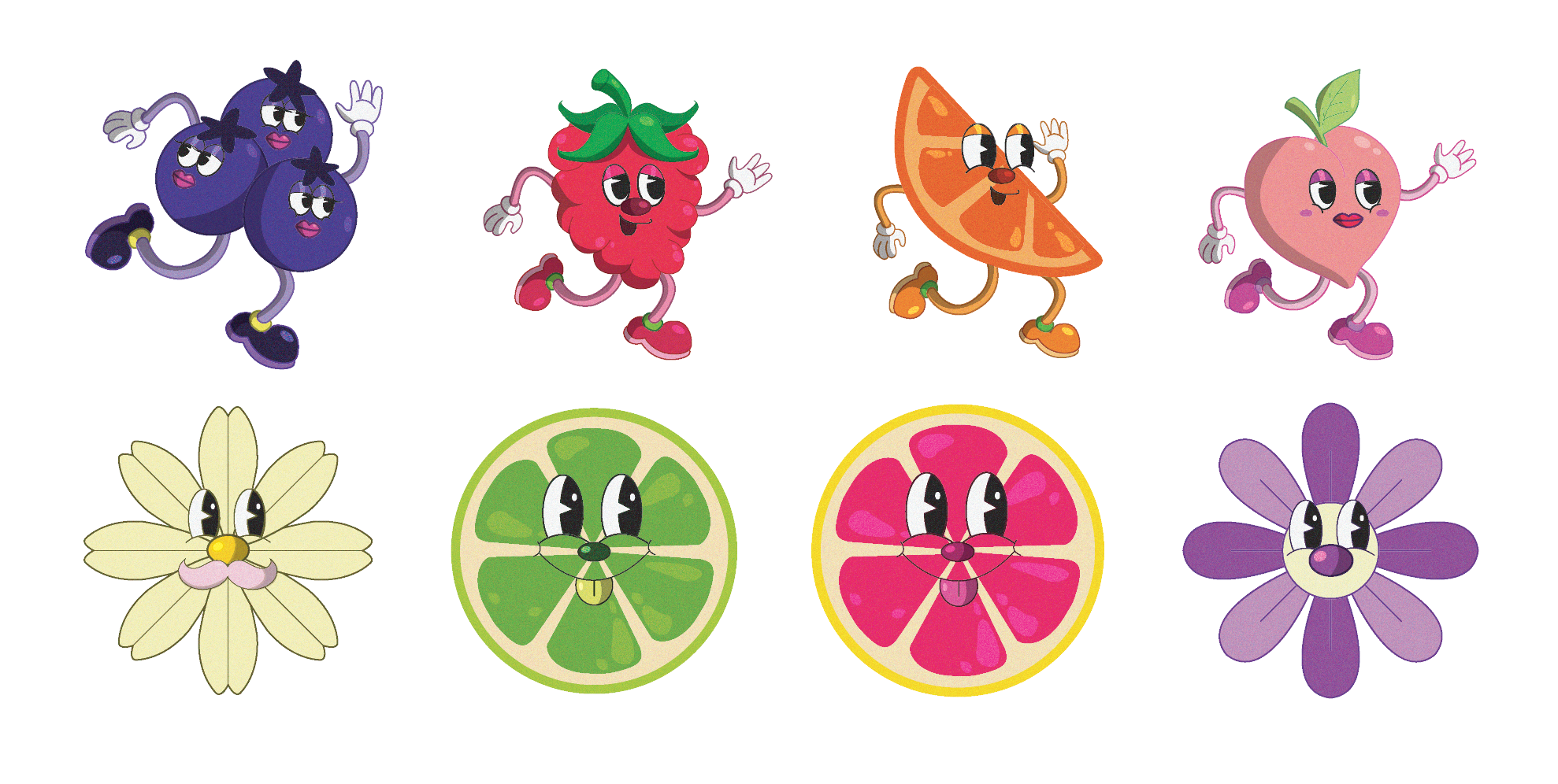
Style ReferenceSample Character SketchesIllustrations via Adobe Illustrator70’s Aesthetic
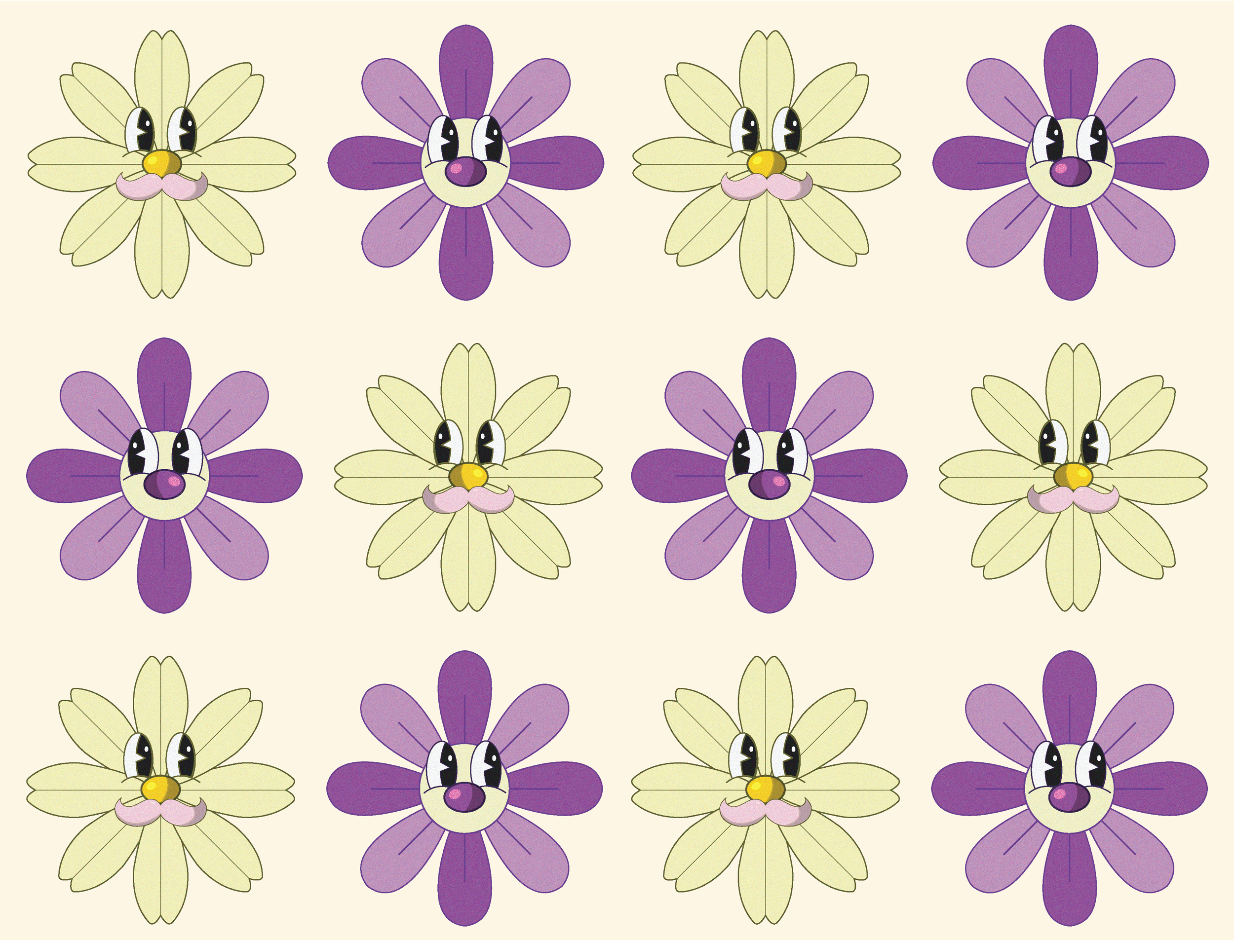
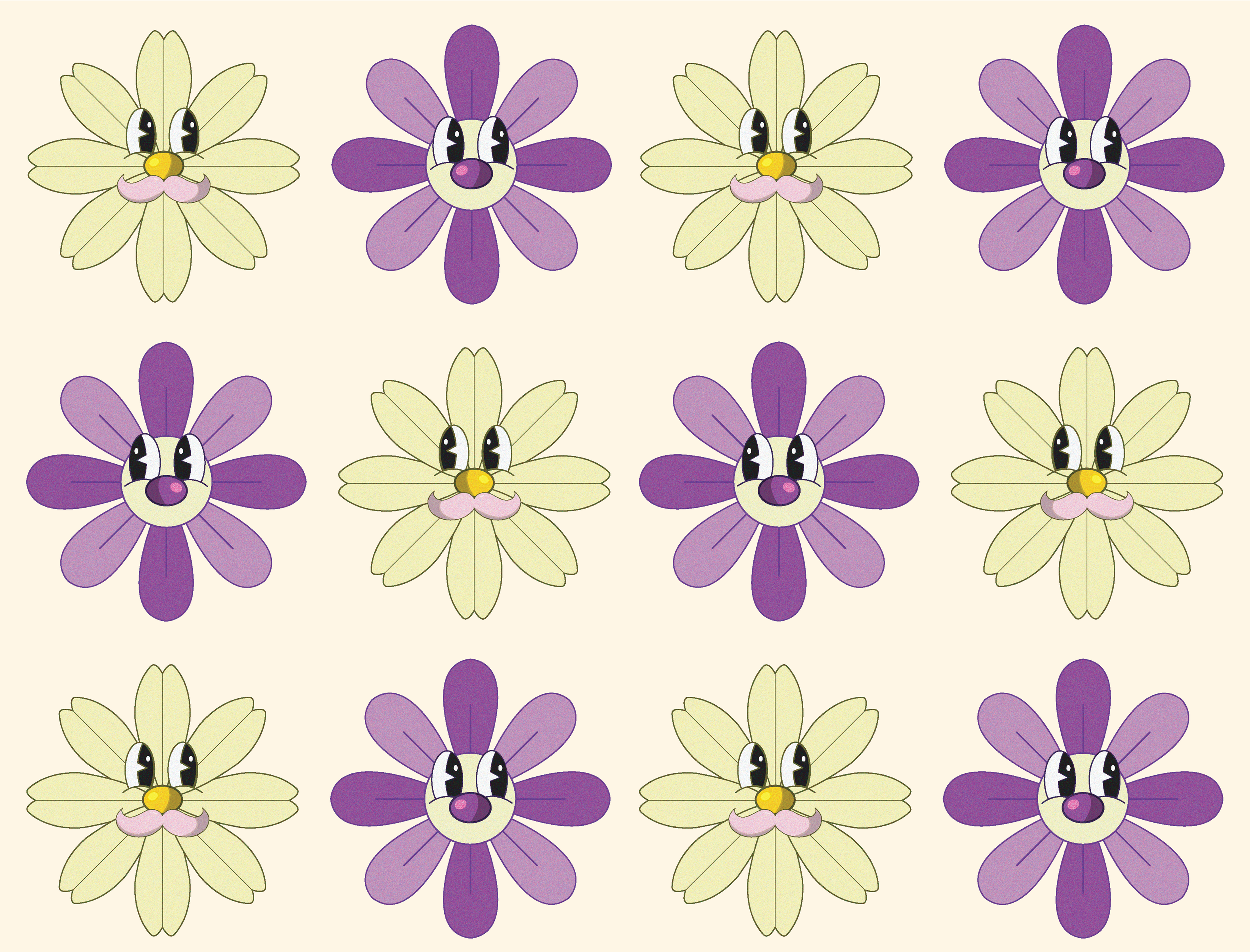
The overarching aesthetic for 'Eden's Frolic' is heavily inspired by retro 70's visuals. This aesthetic was a primary guiding factor in developing the characters which are heavily inspired by iconic 70's cartoons recognizable through their distinctive eyes, gloves, and general dandy look. The goal while creating these characters was to depict various fruits and flowers as jovial, whimsical characters in order to allude to that idea of a 'frolic' being joyful.Type LockupType Lockup
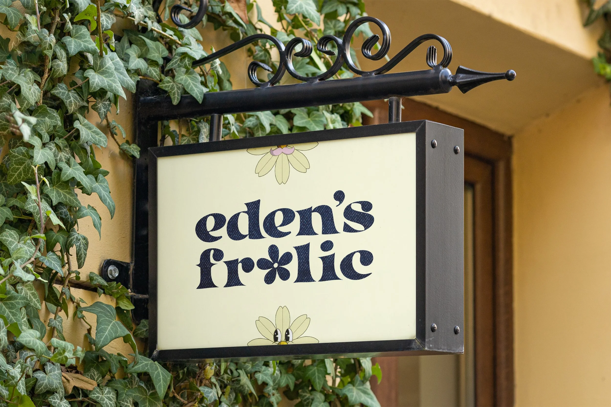
Similar to the illustrations, it was important that the type lockup for the brand also remained within that 70's aesthetic. The goal with the type lockup was to reflect the kind of text that would be seen during the hippie movement, there is also an added denim texture to further reinforce that look.